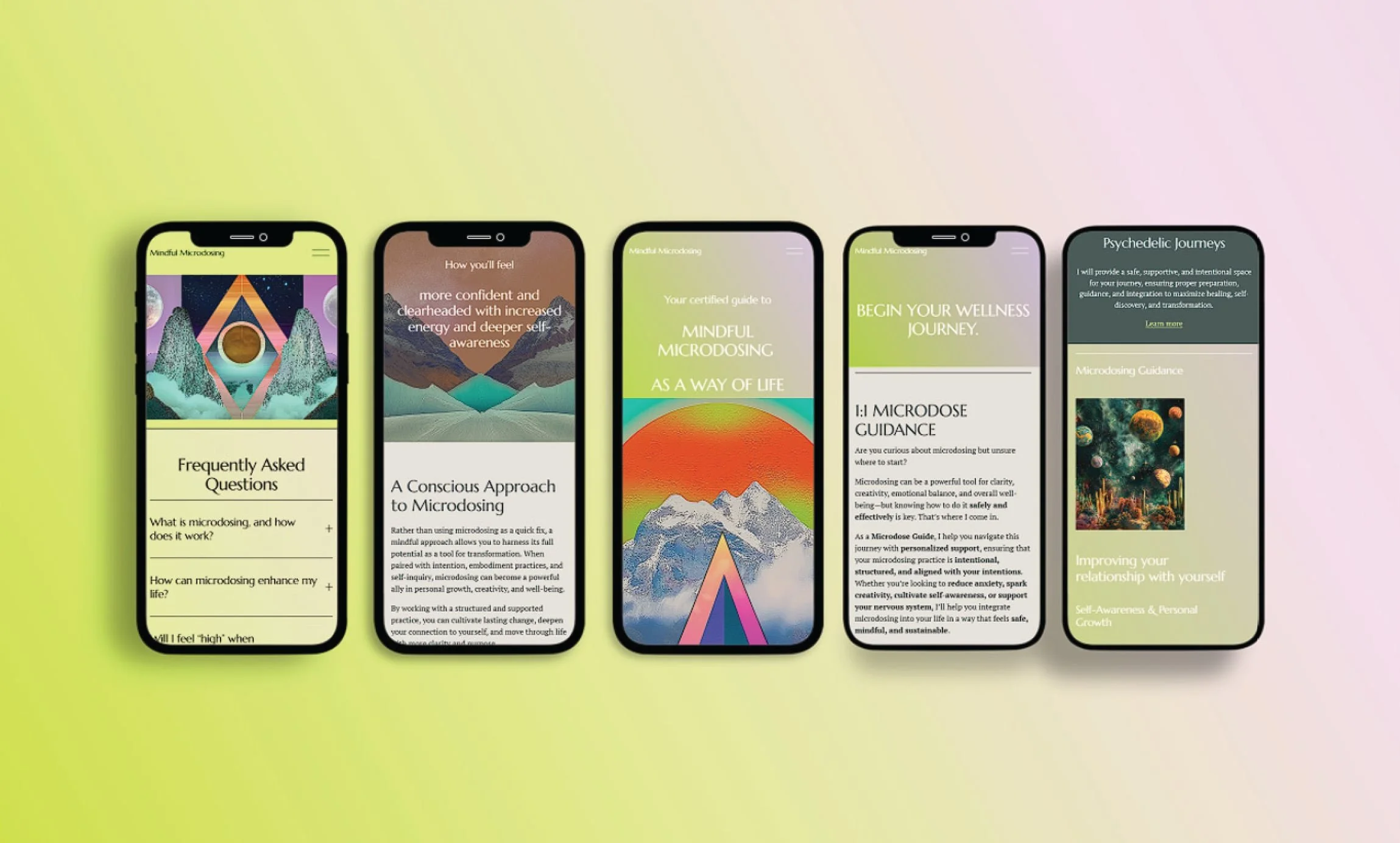
mindful microdose Website
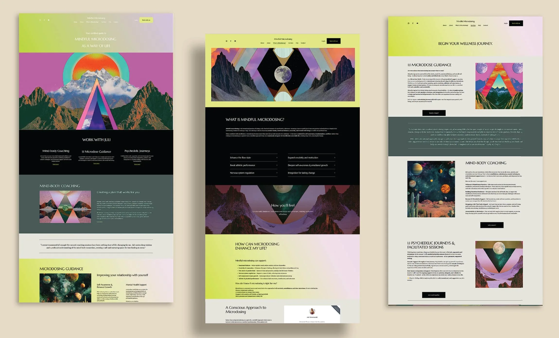
Web design + branding for a microdosing business in Portland, OR.
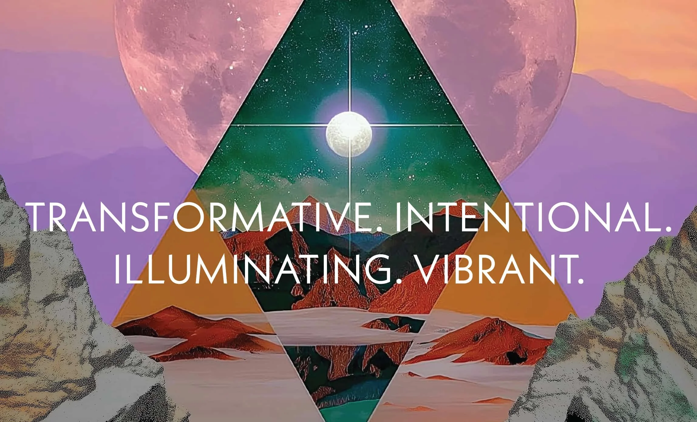
TRANSFORMATIVE. INTENTIONAL. ILLUMINATING. VIBRANT.
brand: who we are
Juli Greenwald, owner of Mindful Microdose, is wanting a newly designed website for her microdosing practice.
It is a good opportunity to put together the branding and identity as well, so elements added later can easily have the branding applied to it for a cohesive look.
As a certified guide, Juli has the experience and expertise, as well as knowledge from Yoga Nidra and other meditation- adjacent practices that enable the client to enter altered states of consciousness, to offer a well thought out system that includes coaching, somatic practices, and psilocybin, a rare combination that together will create a cohesive, supportive, immersive, deep, and safe experience. This approach will set her apart from other similar businesses offering similar services.
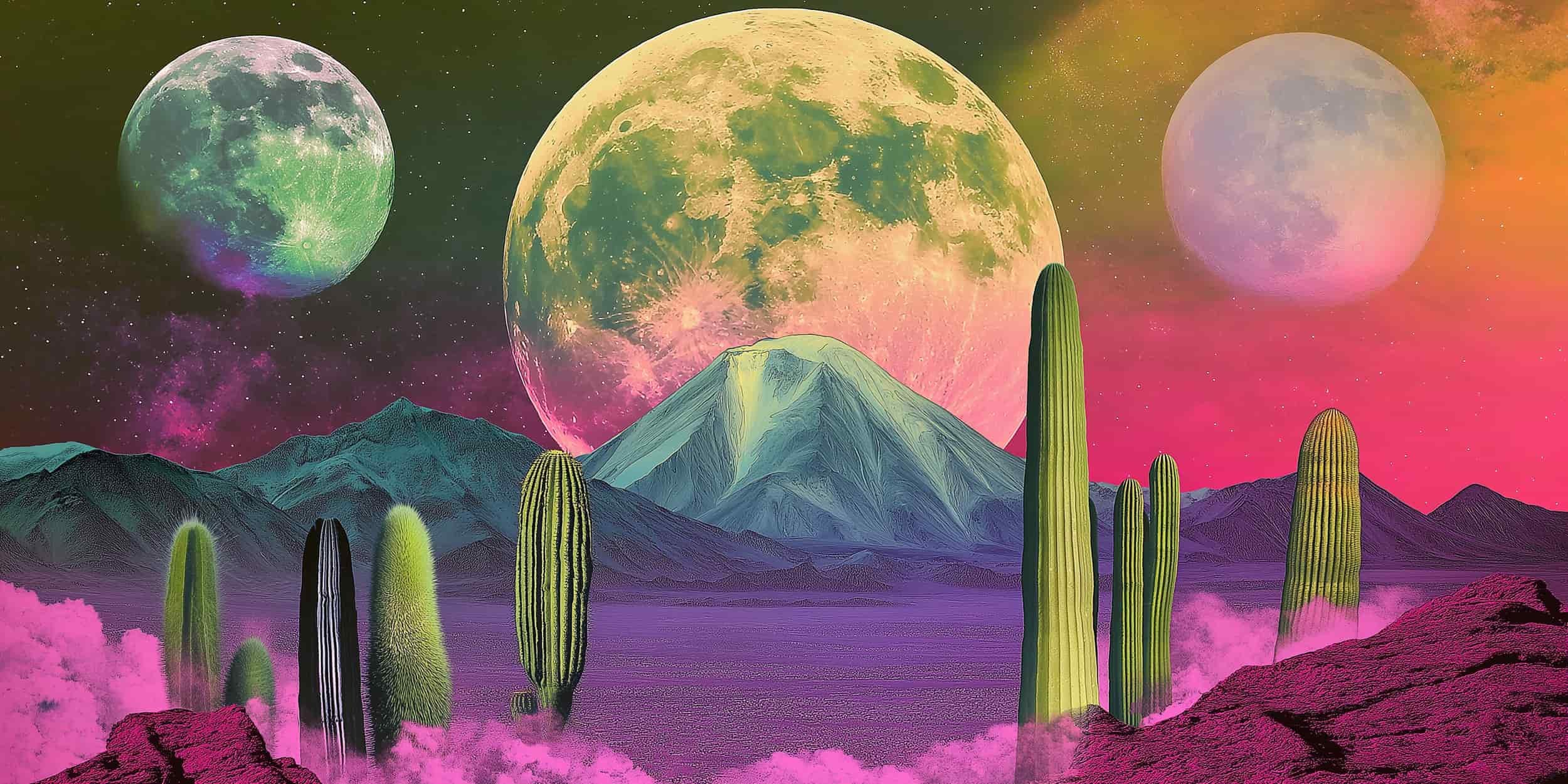
The practice of microdosing falls into a large, vague area that includes wellness, medical and recreational, and can easily be pushed into a certain category without a strong brand and identity.
Our goal is to create a website, and branding, that negates people’s preconceived notions around psilocybin, and create a dialogue and impression that accurately represents what Juli is offering.
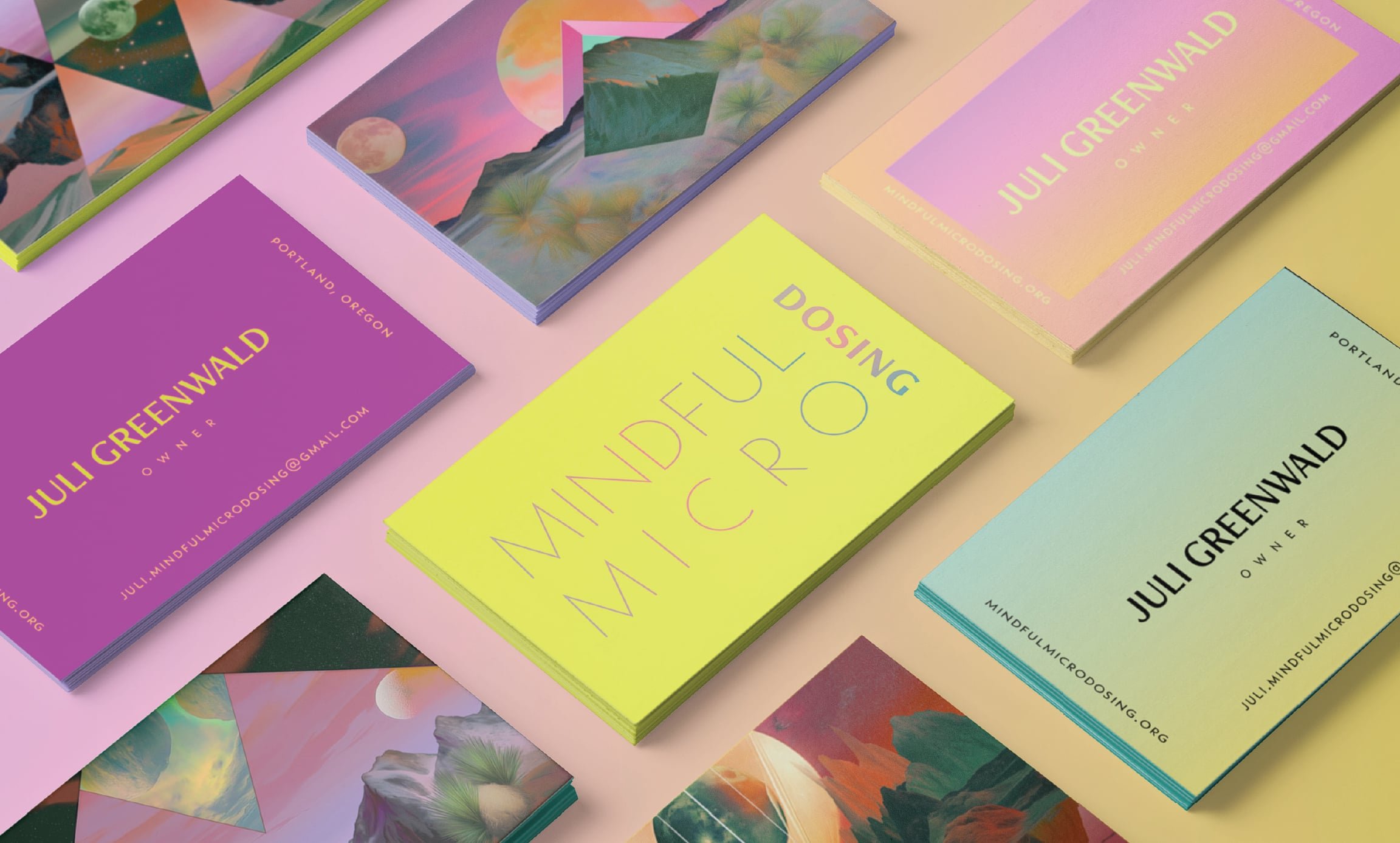

The driving force behind the branding is movement and intent.
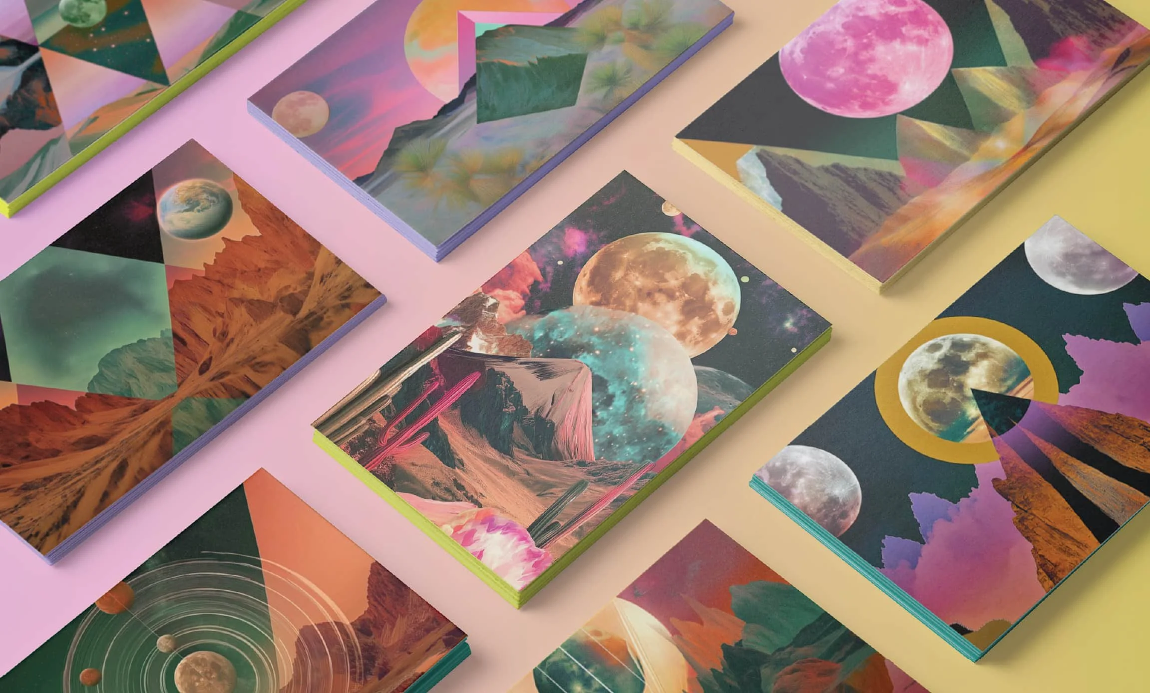
Movement is needed for change. We move our ideas, our thoughts, our bodies. Movement is required for transformation, to move from one state to another.
That momentum allows for curiosity and exploration to happen. This movement can become chaotic if there is no guidance to direct it. Intent allows all of that energy to be pointed where we want it to be.
duality and non-duality, and the flow state.
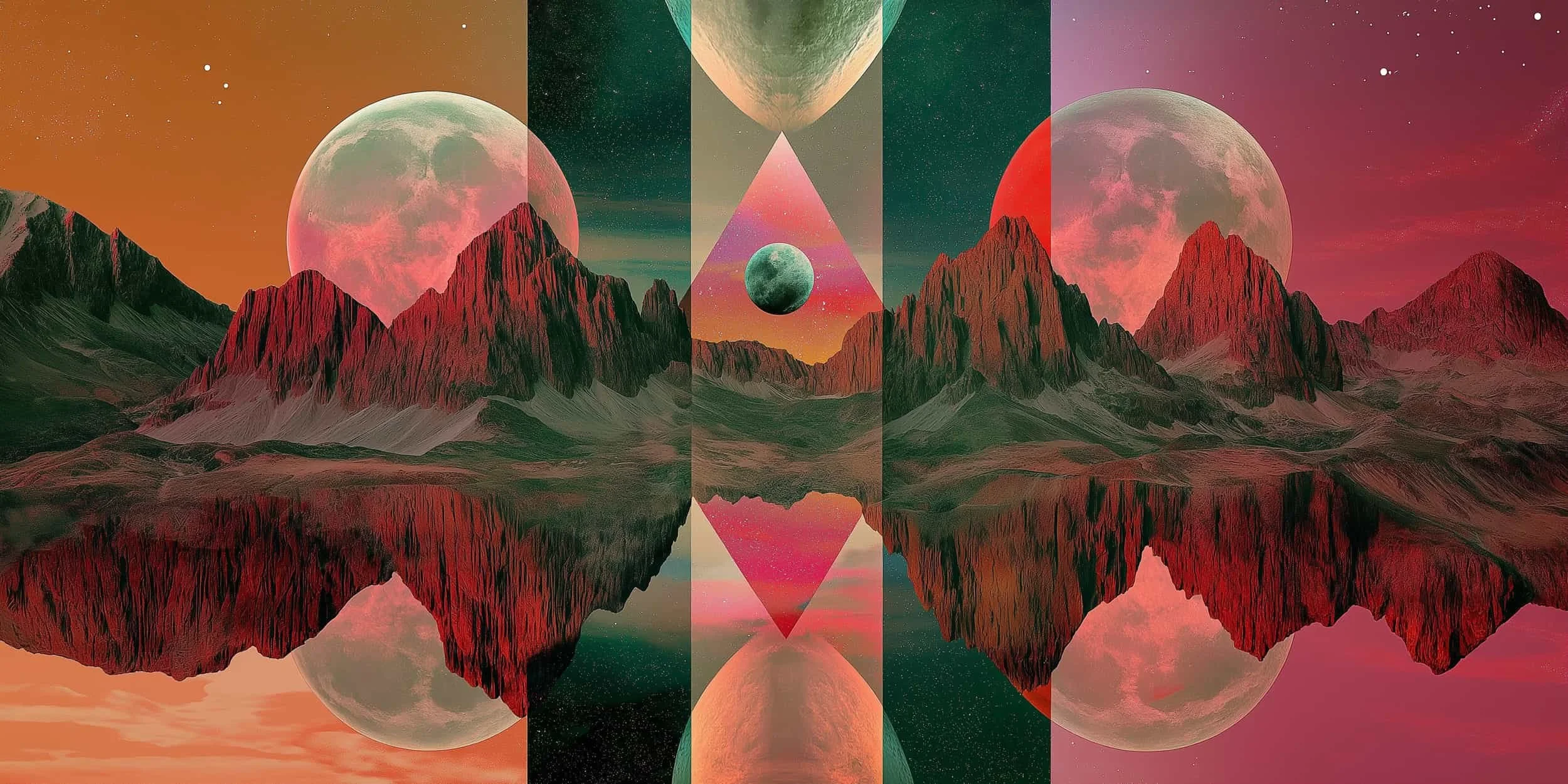
how would these ideas translate visually? The visuals represent both everything being connected, and at the same time, having a separateness.
The flow state is more likely to occur when someone is between under and over stimulation, so elements have a counterpart.
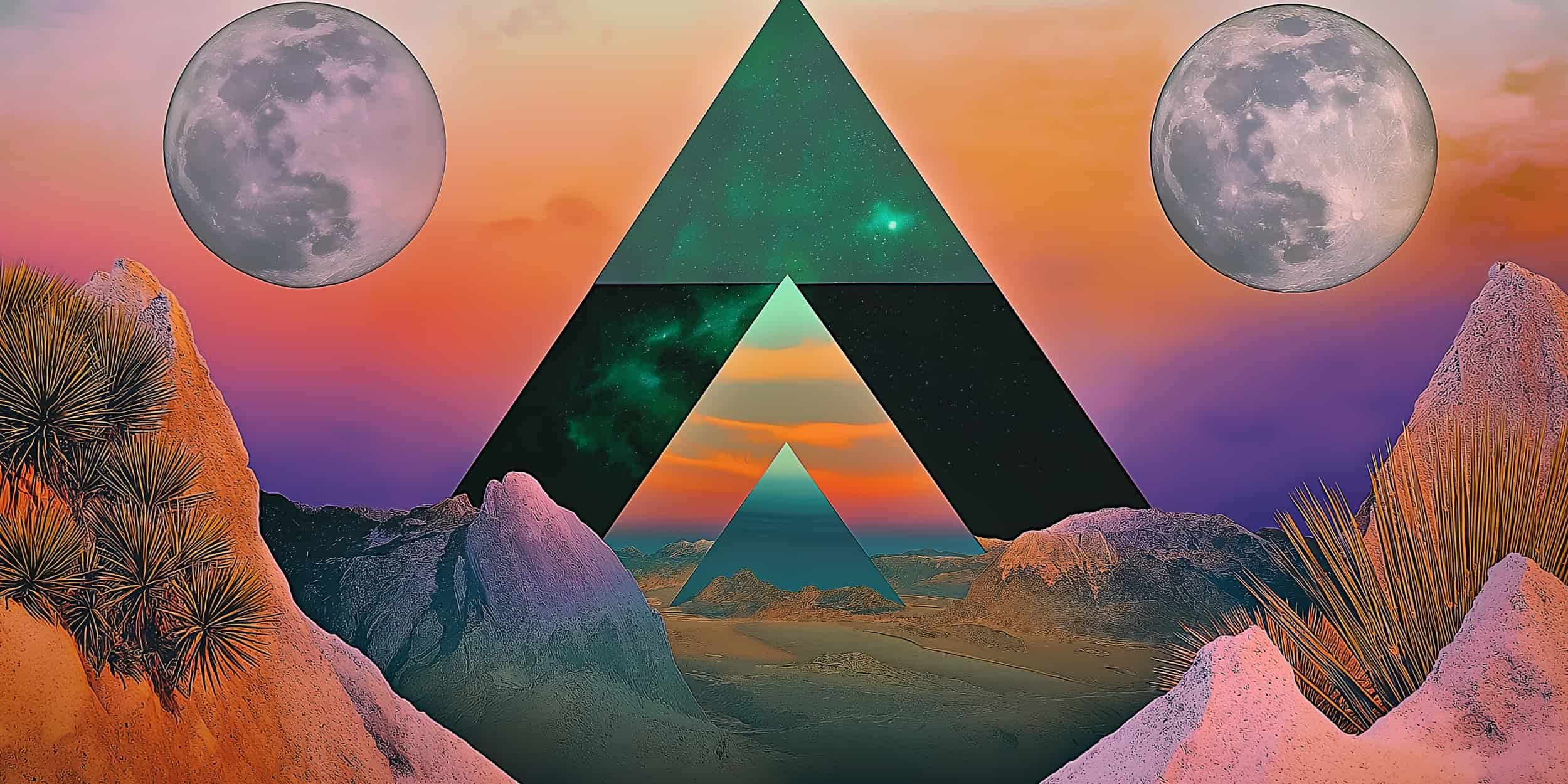
The branding needs to have a solid structure and ground
this will evoke trustworthiness, knowledge, openness, non-judgement, and authenticity. These are solid ideas to build on.
Then we layer on personality and uniqueness, create energy, vibrancy, curiosity and the idea of new ventures.
Visuals that combine the structure and personality will contain elements that are recognizable as both the start point, and the outcome.
Too loud, or too psychedelic-y, too loose, too scattered imagery, will not provoke a sense of inherent trust.
Balance between the two types of visuals is key. The goal is to combine the idea of expertise and competence, with openness and possibility.
identity: color
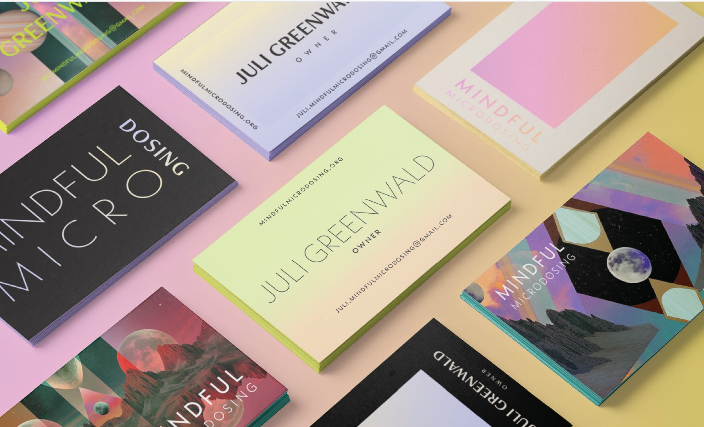
Neon is vivacious, exhilarating, bold, adventurous, and confident.
Neutrals are soothing, understated, grounding, professional, calm, chic, confident, unimposing, and solid.
Neons move, are dynamic, light radiates from the intense color.
Neutrals are more static and reliable, can inhabit large amounts of space without overwhelming, dominating, or being oppressive.
Neutrals can take on neon colors and reflect them back out as softer versions of themselves, reducing harshness or color bombardment, without leeching them of energy or vibrancy.
Neutrals and neons interact in a particular way where each enhances the other while also keeping their inherent traits intact, one does not dominate the other, there is a gentle push and pull that allows for movement and varied uses and applications.
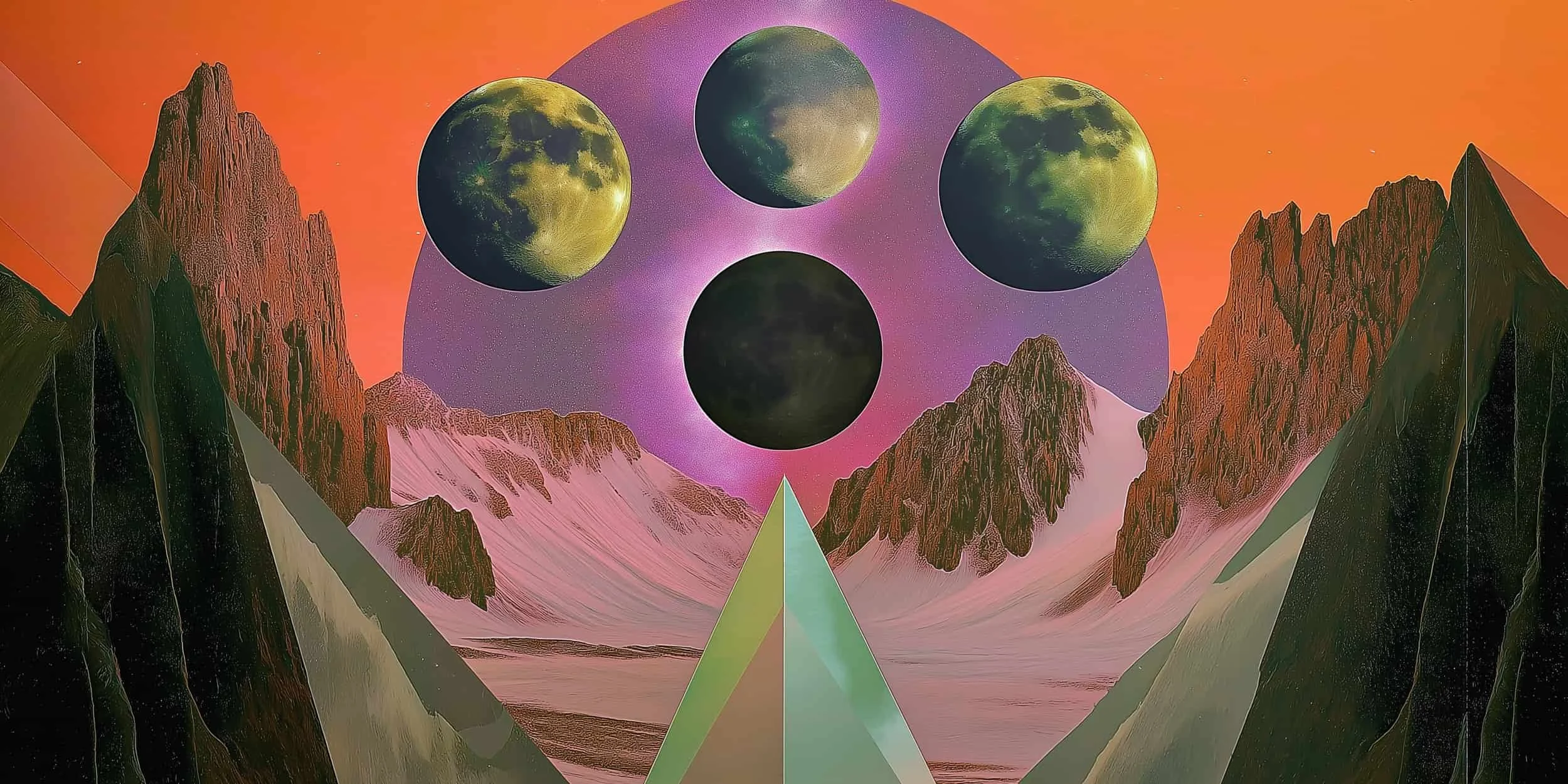
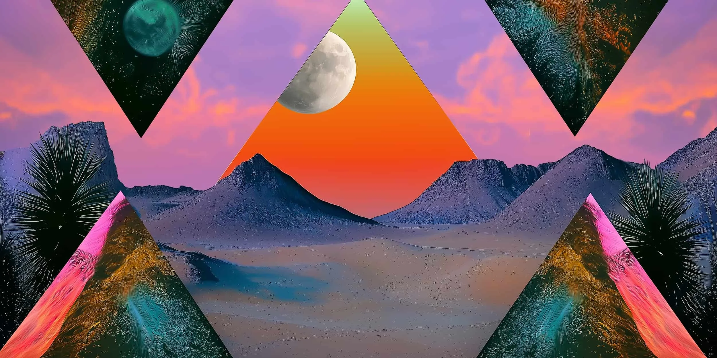
Movement translates to colors that vibrate, like neons and gradients, and shapes that keep the eye moving, like spheres, abstract shapes, collage style images, and mirrored images.
Intent translates to neutral colors that are grounding and solid. Neutrals do not vibrate, and will actually take on some of the neon color, and reflect them back out in a softer way; it’s not a full stop of our eye, but a slowing of it. Shapes that ground are cubes, rectangles and pyramids.
identity: images + Graphics

changeability within a constant.
Moons: a sphere, but a symbol of the feminine, the mystic, the cycle of life, the rhythm of time.
Phases represent stages of growth and contraction, ebb and flow of life, mystery, duality, powerful influence on emotions, mood, behavior, realm between the conscious and unconscious.
The entire moon is always there, but the amount we see changes By changing our perspective, we can see more or less of what makes the entirety of it.
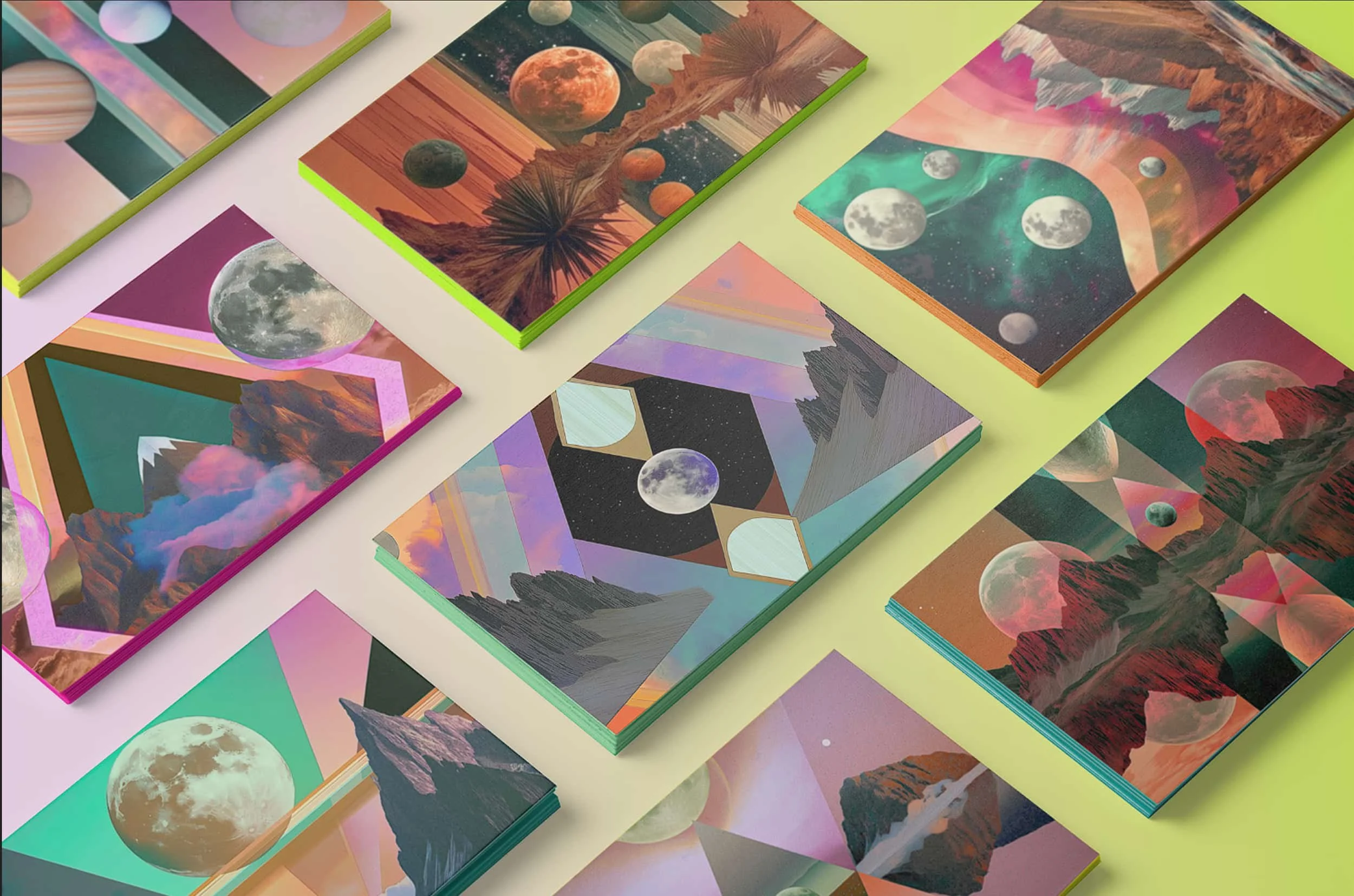
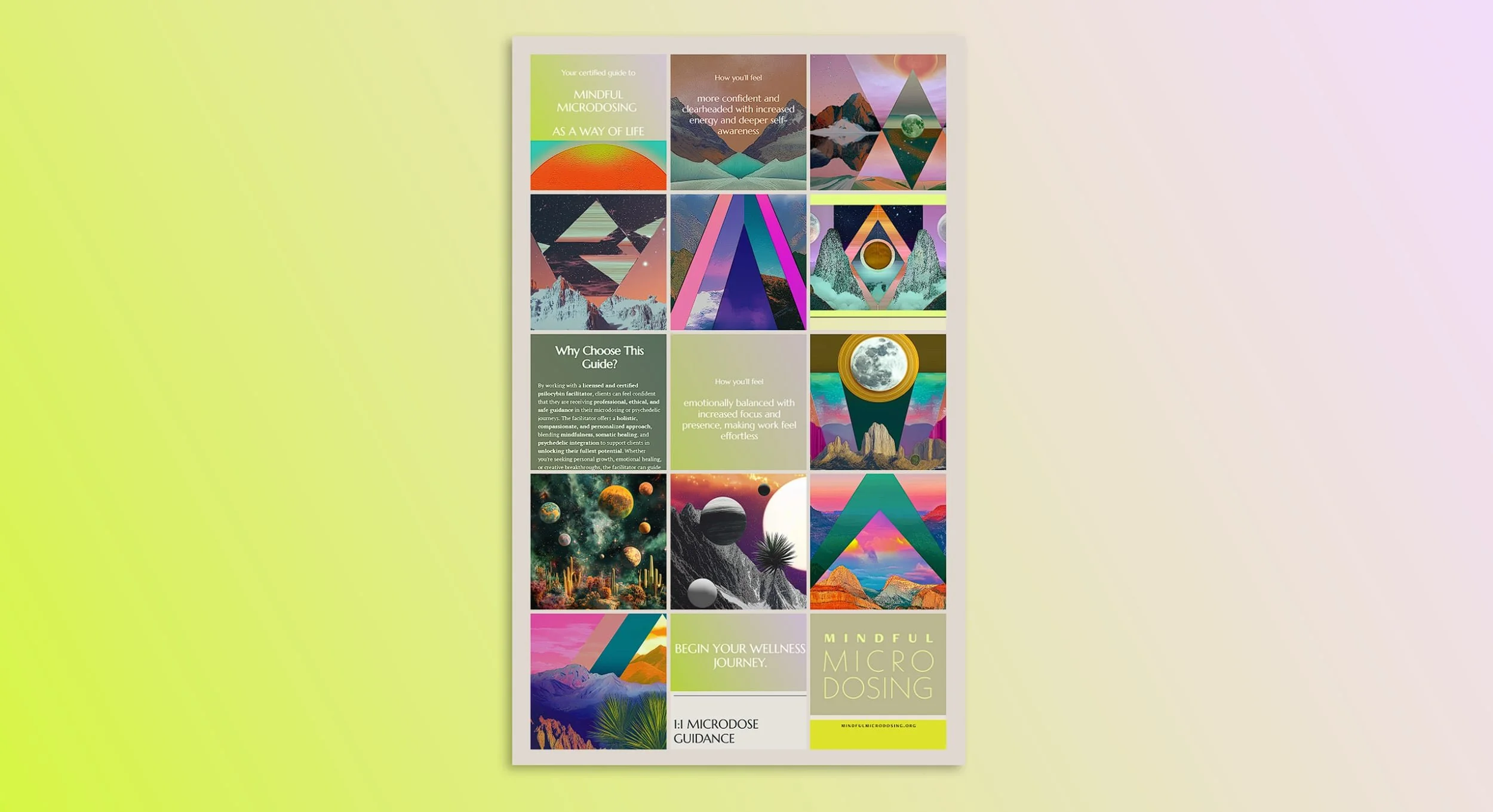
Triangles: stable bases, clear delineation of sides being separate, but all of the same shape, all three sides are needed for stability.
Three components, three pronged approach: somatic, coaching, psilocybin, straight lines, sharp angles, flat, unless a pyramid shape.
Planets/ spheres: continuing without a clear beginning and end, an embrace that fully engulfs you, smooth, never ending, everything connected.
Undulating shapes: organic movement, things are malleable, nothing is static, can be changed, can be unpredictable with direction and shape, but one can have influence on what that shape is, and what direction it is moving in.
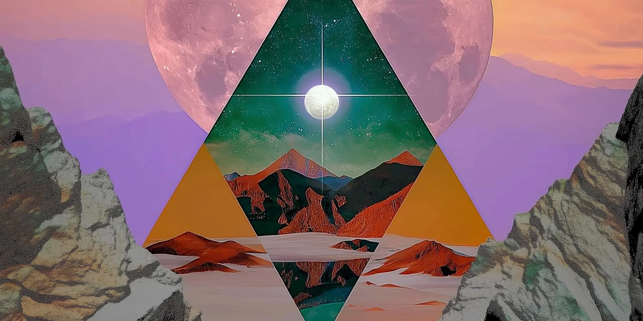
Mountains: solid, grounding, permanent, pyramid and triangle esque, but also a natural, changeable thing.
Can be influenced by weather, can be harsh, or peaceful, majestic, or dominating, both static and inconstant at the same time, weighty.
Mix of photos and illustration, melding of two different mediums to form one unique image.